Resource Management Group Inc here in Wichita asked me to give their site a fresh modern look.
It needed to be geared towards people in the field and in the office.
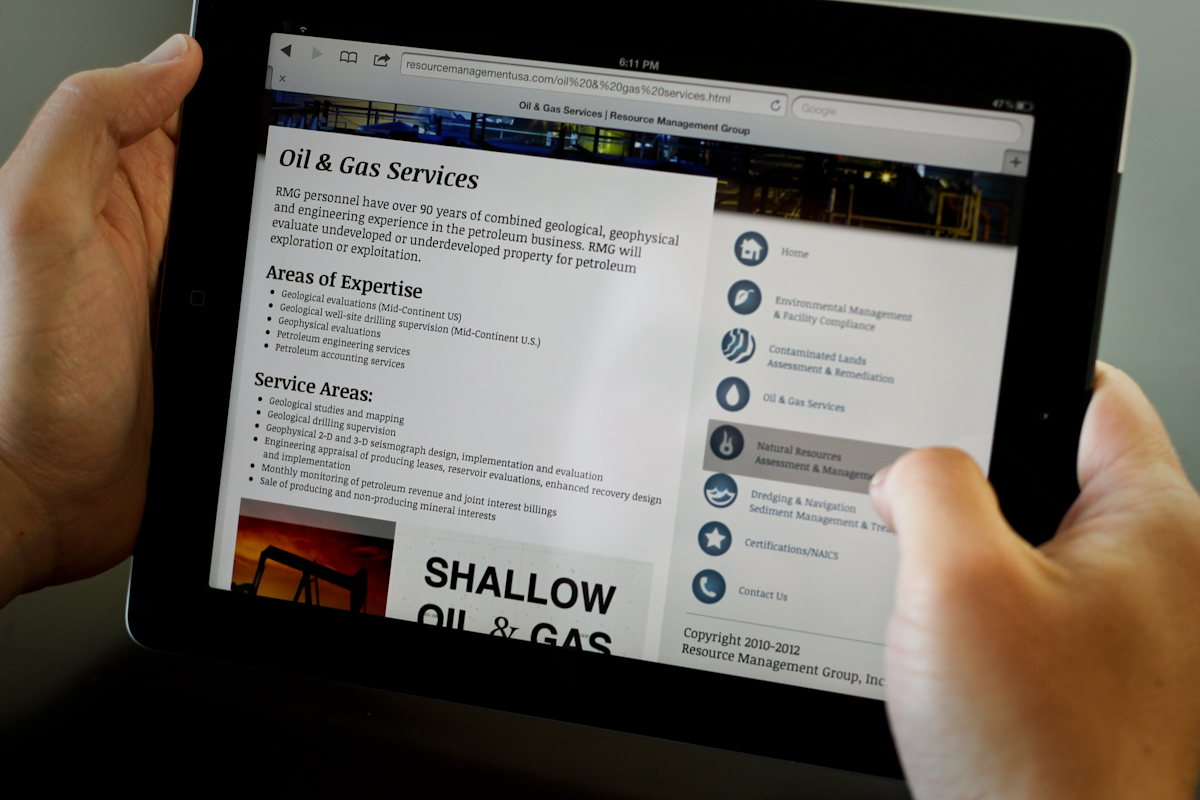
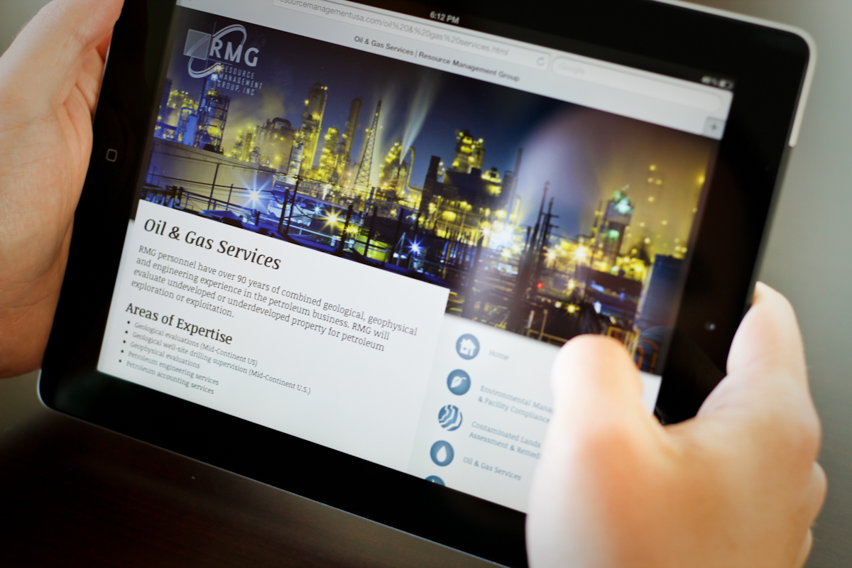
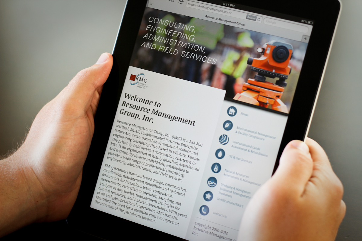
I split the website layout into 3 main sections. The header image, main content, and navigation.
Each page has a dedicated image, copy, navigation, and they all adjust per the screen width. Very flexible design.
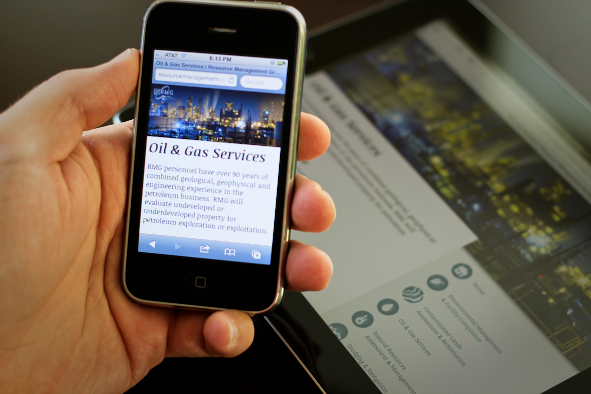
 If you are on a smaller device the menu jumps to the bottom of the page, showing you the content first, and then the navigation. So the user is given what their looking for first and then can navigate to other sections or contact them directly.
A fun trick is to manually make the phone numbers into clickable call-able links. So no worrysing about the link translation per device, always make it a number. Some desktop browsers then translate that into a number to call from the computer too, so the active desktop VOIP user is covered too.
The font on this site scales per device too. My influence was finding a font that was similar to an e-reader. Very legible, often big for readability, and spaced out for clarity.