Why redesign a beautiful site?
Eastminster users were having a little trouble finding important content on their website. Comments ranged from not realizing video and audio messages were readily available, to also not realizing most every important document or meeting was currently publicized on their site. We found the trouble focused mostly on content immediacy. When users landed on the homepage their desired content was in one, or sometimes two clicks away, which is often instant trouble for all users. (of all ages)
It's hard to convince someone to search or look for something when they believe it should be the most important item on the site. Eastminster users have a strong sense of ownership of their information. They produce some beautiful publications, riveting messages every Sunday, and have tons of events throughout the year. Plus every ministry's information is just as important as the other.
Fresh News
One of the website's strong-points is the amount of fresh content. There are updated pages and new events and promotions added daily. How do you display all of this information effectively?
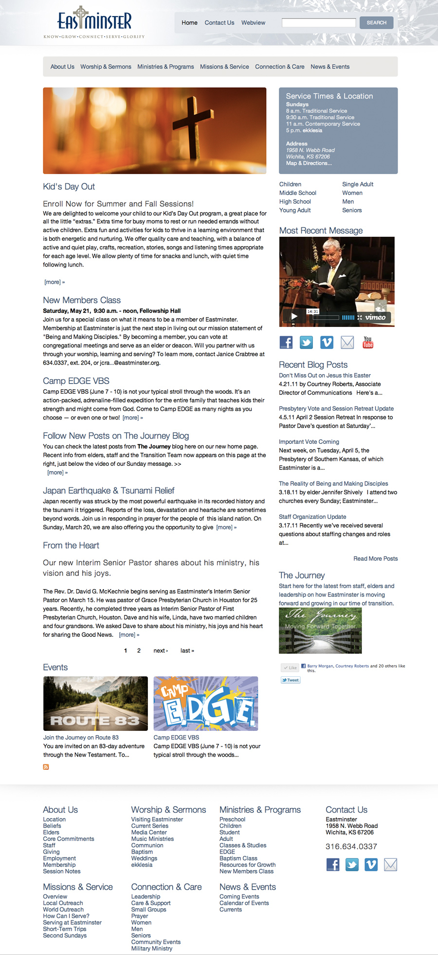
We thought it to be best to introduce an often overlooked feature, the newsfeed. It was on the homepage already but not located in the hot-spot where users eyes go to first, the top left corner. The beautiful banner slide-show was taking up a lot of space that is now being used for important information users regularly visit the site for.
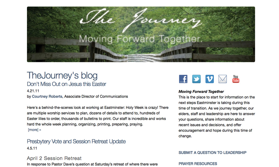
The most recent blog posts from every blog that Eastminster publishes is now on the homepage too. It dynamically collects posts from multiple blog’s *feeds*.
I want to go to there
The importance of their content brought us to another decision point about ease of navigation and ease of use.
Along with adding a newsfeed concept, ease of use was a key factor in the new design. Every age group uses this site. It has to be user friendly for ages 6 through 96. That's where the drop down menu evaluation begun. Every ministry is available one click away, it's awesome.
Also, once click access to those pages is located in the footer of every page. The sub pages of each main page are listed in a clear, simple site-map in the footer, consistently.
Multi / Social / Media
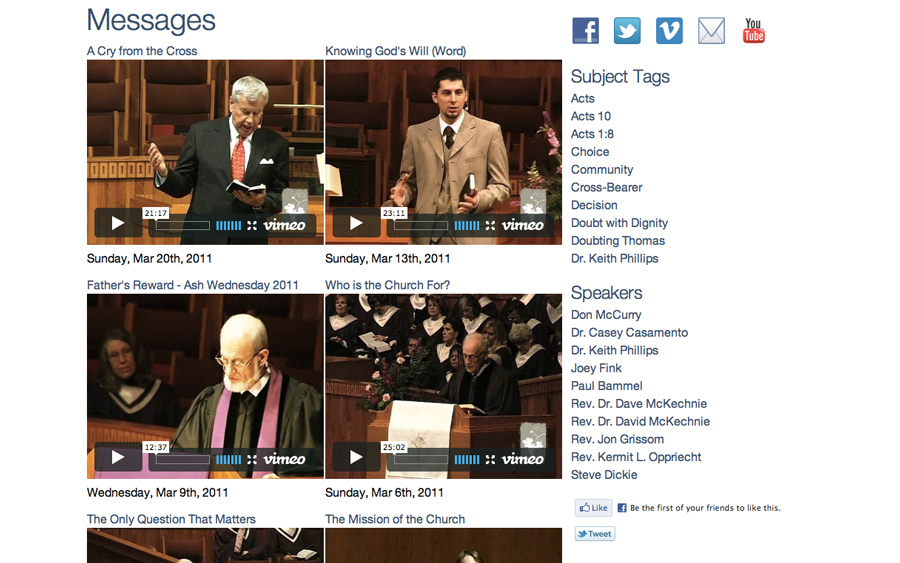
There's also the most recent message (sermon), available from their new Vimeo account. It's located in an embedded video player on the homepage. Vimeo allows for lengthy content, way longer than 15min. I created a new sortable and taggable video browser to view their most recent sermons directly on their site. You can also check out and comment on any of their 3rd party accounts, directly from your account (Web 2.0, right where you are!).
They already had a YouTube account with videos from months past, a lot of videos, so we put their YouTube account icon with the rest of their icons, Facebook, Twitter, Vimeo, and even a signup form for their Email Newsletter through MailChimp. That's another strong point, they publish everything everywhere. All quality content, all the time. That's why the icons to each of those mediums are available on every single page.
Details are the Design
With all of this fresh content the design had to be clean. It had to be simple enough to keep the users attention on the content and not on the intense graphical edgey shades of popping grunge (sorry, church marketing lingo). This new design is for the users, for the content they visit the site for, and for the many ways they can follow and interact with the church.
Recaps
- Newsfeed rich homepage
- Immediate access to every page and section of their site.
- Clean and simple design that focuses on the content.
- Easily updatable from their office from multiple administrative accounts
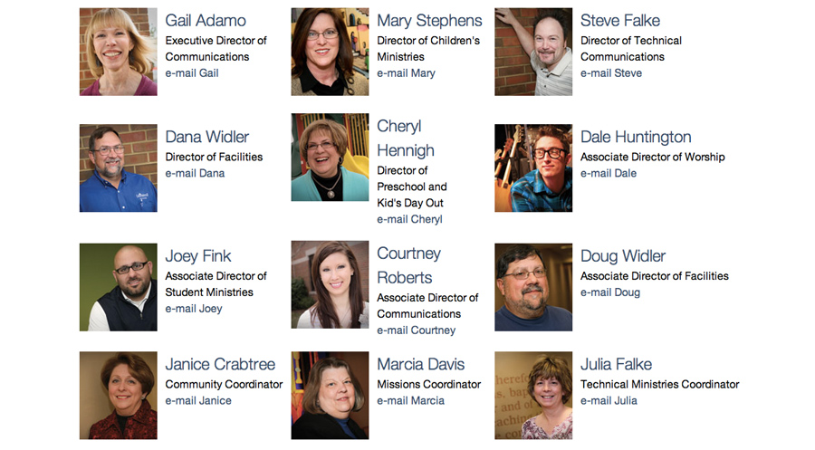
- I also took their new staff portraits!
- Loved this project!
Be sure to check out Eastminster's previous site design before you go!


