We love this website. It is one of our most beloved designs we've ever done.
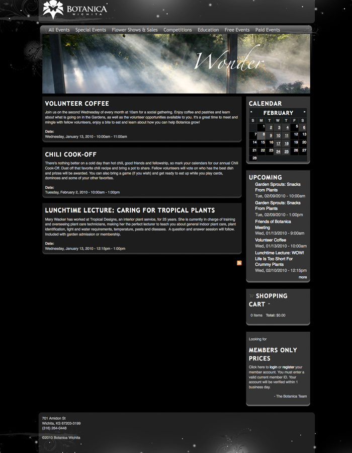
We understand the web is moving away from flash, but we hope this look never gets old. Since this flash website was built they've added on a Content Management System that compliments the design very well and allows for the public to sign-up for their events. They are using the web exactly how they should, and they are seeing the results.
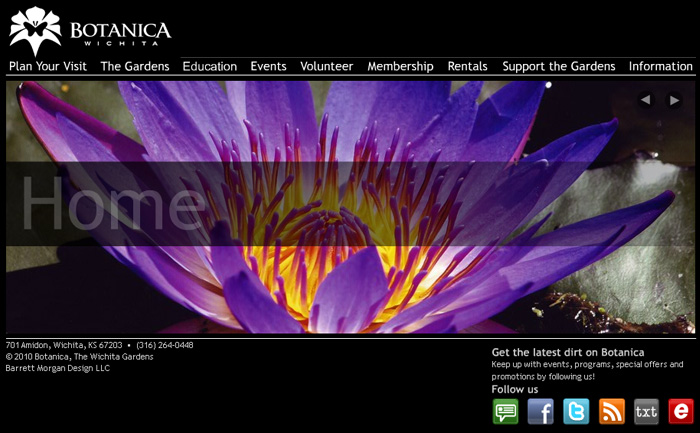
The front page of Botanica Wichita's website is a slide-show of photographs from their photo contests and regular photographers. They are highlighted by gradual movement and a stark contrast to the black background. The photos are framed by the menu-bar on the top, and the technical details at the bottom. It's simple, and it's beautiful.
We hope you like it too! We just wrote about their new Summer Style over on our blog, so be sure to check those images out too, and go to Botanica's site!


